How to create a podcast sponsorship report advertisers take seriously

Nathaniel DeSantis
Sponsorship & Monetization

Introduction
Closing a sponsor is the fun part. Keeping one is where the real money is, and that comes down to one unglamorous document: the podcast sponsorship report you send mid-campaign and at renewal time.
Most podcasters send a screenshot of their dashboard with a thumbs-up emoji and hope for the best. Advertisers notice. A media buyer looks at reports from newsletters, YouTube channels, and paid social all day, and a cropped screenshot with no dates on it does not inspire a second check.
This guide covers exactly what to include, how often to send it, and why a clean CSV beats a screenshot every single time.
Key takeaway
Report against what you promised: downloads delivered vs. downloads sold
Show the daily download curve around the ad flight, not just a total
Include listener geography — sponsors care where their message landed
Send CSVs, not screenshots; buyers want data they can work with
Pick a cadence (mid-flight plus wrap-up) and never make the sponsor chase you
Start with delivered vs. promised
Every sponsorship deal has an implied promise, usually a download estimate per episode within 30 days of release. Your report should open by putting that promise next to reality.
If you sold the campaign on 5,000 downloads per episode and delivered 6,200, say so in the first line. If you came in under, say that too — with the actual number and a plan. Sponsors forgive a miss they can see coming; they do not forgive discovering it themselves.
Episodes in the flight, with release dates
Estimated downloads you sold against
Actual 30-day downloads per episode
Delivery percentage, stated plainly
Show the daily curve around the ad flight
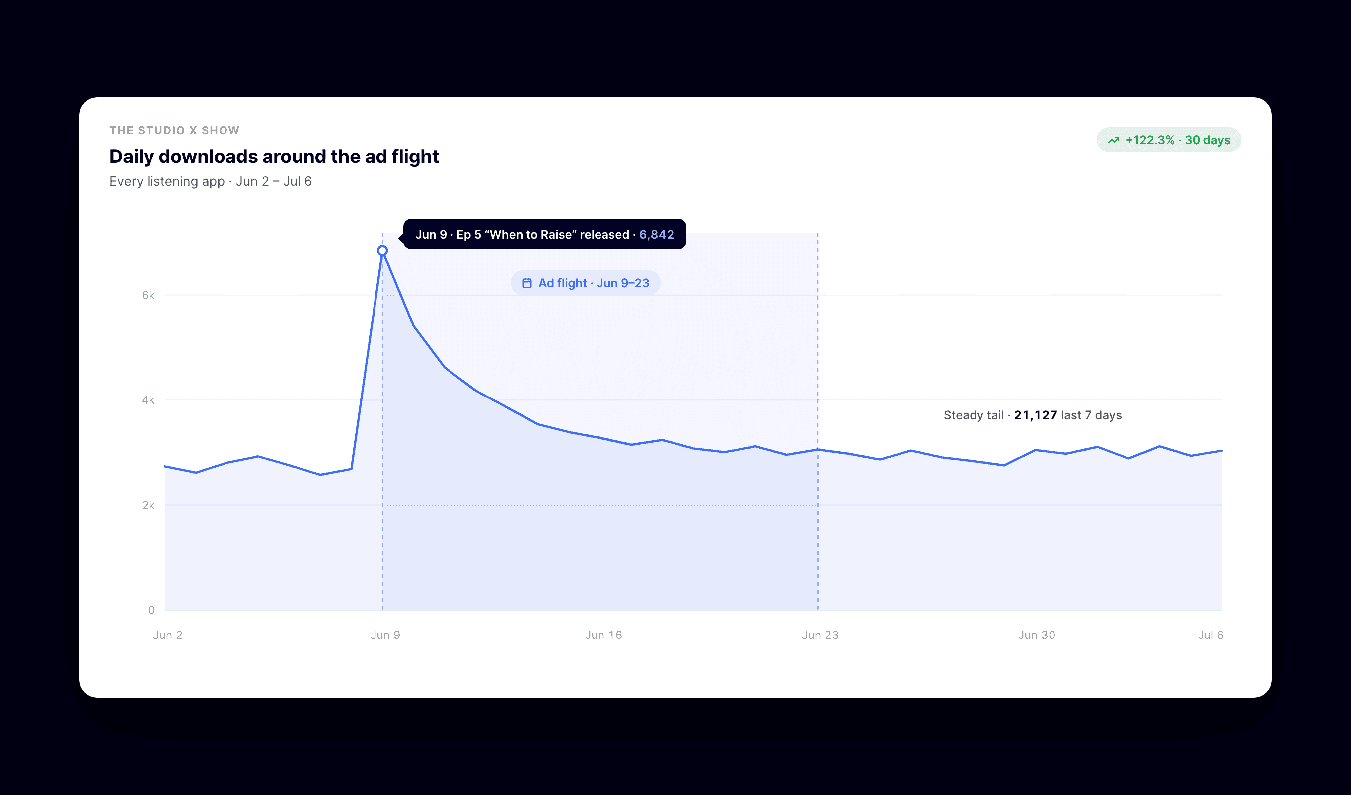
A single total hides the story. A day-by-day download timeline shows the sponsor exactly when their message was reaching ears: the release-day spike, the first-week tail, and the slow burn from back-catalog listeners.
This matters because sponsors often see their own signal — promo code redemptions, landing page visits — clustered around those same days. When your curve lines up with their conversions, you have just proven attribution without a tracking pixel in sight.
Include geography, even if they didn’t ask
Most sponsors sell to somewhere. A regional brand wants to know your audience skews toward their market; a national brand wants to see the spread. Either way, a country and metro breakdown makes your report feel like media, not a hobby.
Two or three lines is enough: top countries by share, top US metros, and any concentration that is relevant to the sponsor’s footprint.
Send data, not screenshots
A screenshot is a photograph of a number. A CSV is a number the buyer can actually use — drop into their own spreadsheet, compare against other channels, forward to their boss with a pivot table attached.
It also signals confidence. Screenshots can be cropped, filtered, and flattered. Raw daily data says “audit me.” That trust is worth real CPM at renewal.
Export a day-by-day episode timeline covering the flight dates
Export episode performance rankings so the sponsored episodes have context
Attach both CSVs to a short email with three sentences of narrative
Keep the email skimmable — the data does the heavy lifting
Pick a cadence and stick to it
For a typical four-to-eight episode flight, two reports work well: one mid-flight check-in and one wrap-up within a week of the last sponsored episode clearing its early download window.
For ongoing sponsors, monthly is the sweet spot. The exact rhythm matters less than the fact that it is a rhythm — a sponsor who never has to ask “how’s it going?” is a sponsor who renews.
A simple report structure that works
You do not need a designer. A short email plus attachments beats a ten-page PDF nobody opens.
Three-sentence summary: delivery vs. promise, one highlight, next step
Table of sponsored episodes with 30-day downloads
Daily timeline CSV attached
Geography snapshot: top countries and metros
One line inviting questions or a renewal conversation
Conclusion
A sponsorship report is not paperwork — it is the sales pitch for your next deal, written in the sponsor’s favorite language: numbers they can verify.
Report delivered downloads against the promise, show the daily curve, include geography, and send it all as clean CSVs on a schedule. If pulling those files currently means wrestling your hosting dashboard, BuzzyPod turns OP3-powered analytics into one-click CSV exports — rankings, timelines, and daily audience history — for $10 a month, so your next sponsor report takes minutes instead of an evening.
Related reading
Introduction
Closing a sponsor is the fun part. Keeping one is where the real money is, and that comes down to one unglamorous document: the podcast sponsorship report you send mid-campaign and at renewal time.
Most podcasters send a screenshot of their dashboard with a thumbs-up emoji and hope for the best. Advertisers notice. A media buyer looks at reports from newsletters, YouTube channels, and paid social all day, and a cropped screenshot with no dates on it does not inspire a second check.
This guide covers exactly what to include, how often to send it, and why a clean CSV beats a screenshot every single time.
Key takeaway
Report against what you promised: downloads delivered vs. downloads sold
Show the daily download curve around the ad flight, not just a total
Include listener geography — sponsors care where their message landed
Send CSVs, not screenshots; buyers want data they can work with
Pick a cadence (mid-flight plus wrap-up) and never make the sponsor chase you
Start with delivered vs. promised
Every sponsorship deal has an implied promise, usually a download estimate per episode within 30 days of release. Your report should open by putting that promise next to reality.
If you sold the campaign on 5,000 downloads per episode and delivered 6,200, say so in the first line. If you came in under, say that too — with the actual number and a plan. Sponsors forgive a miss they can see coming; they do not forgive discovering it themselves.
Episodes in the flight, with release dates
Estimated downloads you sold against
Actual 30-day downloads per episode
Delivery percentage, stated plainly
Show the daily curve around the ad flight
A single total hides the story. A day-by-day download timeline shows the sponsor exactly when their message was reaching ears: the release-day spike, the first-week tail, and the slow burn from back-catalog listeners.
This matters because sponsors often see their own signal — promo code redemptions, landing page visits — clustered around those same days. When your curve lines up with their conversions, you have just proven attribution without a tracking pixel in sight.
Include geography, even if they didn’t ask
Most sponsors sell to somewhere. A regional brand wants to know your audience skews toward their market; a national brand wants to see the spread. Either way, a country and metro breakdown makes your report feel like media, not a hobby.
Two or three lines is enough: top countries by share, top US metros, and any concentration that is relevant to the sponsor’s footprint.
Send data, not screenshots
A screenshot is a photograph of a number. A CSV is a number the buyer can actually use — drop into their own spreadsheet, compare against other channels, forward to their boss with a pivot table attached.
It also signals confidence. Screenshots can be cropped, filtered, and flattered. Raw daily data says “audit me.” That trust is worth real CPM at renewal.
Export a day-by-day episode timeline covering the flight dates
Export episode performance rankings so the sponsored episodes have context
Attach both CSVs to a short email with three sentences of narrative
Keep the email skimmable — the data does the heavy lifting
Pick a cadence and stick to it
For a typical four-to-eight episode flight, two reports work well: one mid-flight check-in and one wrap-up within a week of the last sponsored episode clearing its early download window.
For ongoing sponsors, monthly is the sweet spot. The exact rhythm matters less than the fact that it is a rhythm — a sponsor who never has to ask “how’s it going?” is a sponsor who renews.
A simple report structure that works
You do not need a designer. A short email plus attachments beats a ten-page PDF nobody opens.
Three-sentence summary: delivery vs. promise, one highlight, next step
Table of sponsored episodes with 30-day downloads
Daily timeline CSV attached
Geography snapshot: top countries and metros
One line inviting questions or a renewal conversation
Conclusion
A sponsorship report is not paperwork — it is the sales pitch for your next deal, written in the sponsor’s favorite language: numbers they can verify.
Report delivered downloads against the promise, show the daily curve, include geography, and send it all as clean CSVs on a schedule. If pulling those files currently means wrestling your hosting dashboard, BuzzyPod turns OP3-powered analytics into one-click CSV exports — rankings, timelines, and daily audience history — for $10 a month, so your next sponsor report takes minutes instead of an evening.
Related reading
Introduction
Closing a sponsor is the fun part. Keeping one is where the real money is, and that comes down to one unglamorous document: the podcast sponsorship report you send mid-campaign and at renewal time.
Most podcasters send a screenshot of their dashboard with a thumbs-up emoji and hope for the best. Advertisers notice. A media buyer looks at reports from newsletters, YouTube channels, and paid social all day, and a cropped screenshot with no dates on it does not inspire a second check.
This guide covers exactly what to include, how often to send it, and why a clean CSV beats a screenshot every single time.
Key takeaway
Report against what you promised: downloads delivered vs. downloads sold
Show the daily download curve around the ad flight, not just a total
Include listener geography — sponsors care where their message landed
Send CSVs, not screenshots; buyers want data they can work with
Pick a cadence (mid-flight plus wrap-up) and never make the sponsor chase you
Start with delivered vs. promised
Every sponsorship deal has an implied promise, usually a download estimate per episode within 30 days of release. Your report should open by putting that promise next to reality.
If you sold the campaign on 5,000 downloads per episode and delivered 6,200, say so in the first line. If you came in under, say that too — with the actual number and a plan. Sponsors forgive a miss they can see coming; they do not forgive discovering it themselves.
Episodes in the flight, with release dates
Estimated downloads you sold against
Actual 30-day downloads per episode
Delivery percentage, stated plainly
Show the daily curve around the ad flight
A single total hides the story. A day-by-day download timeline shows the sponsor exactly when their message was reaching ears: the release-day spike, the first-week tail, and the slow burn from back-catalog listeners.
This matters because sponsors often see their own signal — promo code redemptions, landing page visits — clustered around those same days. When your curve lines up with their conversions, you have just proven attribution without a tracking pixel in sight.
Include geography, even if they didn’t ask
Most sponsors sell to somewhere. A regional brand wants to know your audience skews toward their market; a national brand wants to see the spread. Either way, a country and metro breakdown makes your report feel like media, not a hobby.
Two or three lines is enough: top countries by share, top US metros, and any concentration that is relevant to the sponsor’s footprint.
Send data, not screenshots
A screenshot is a photograph of a number. A CSV is a number the buyer can actually use — drop into their own spreadsheet, compare against other channels, forward to their boss with a pivot table attached.
It also signals confidence. Screenshots can be cropped, filtered, and flattered. Raw daily data says “audit me.” That trust is worth real CPM at renewal.
Export a day-by-day episode timeline covering the flight dates
Export episode performance rankings so the sponsored episodes have context
Attach both CSVs to a short email with three sentences of narrative
Keep the email skimmable — the data does the heavy lifting
Pick a cadence and stick to it
For a typical four-to-eight episode flight, two reports work well: one mid-flight check-in and one wrap-up within a week of the last sponsored episode clearing its early download window.
For ongoing sponsors, monthly is the sweet spot. The exact rhythm matters less than the fact that it is a rhythm — a sponsor who never has to ask “how’s it going?” is a sponsor who renews.
A simple report structure that works
You do not need a designer. A short email plus attachments beats a ten-page PDF nobody opens.
Three-sentence summary: delivery vs. promise, one highlight, next step
Table of sponsored episodes with 30-day downloads
Daily timeline CSV attached
Geography snapshot: top countries and metros
One line inviting questions or a renewal conversation
Conclusion
A sponsorship report is not paperwork — it is the sales pitch for your next deal, written in the sponsor’s favorite language: numbers they can verify.
Report delivered downloads against the promise, show the daily curve, include geography, and send it all as clean CSVs on a schedule. If pulling those files currently means wrestling your hosting dashboard, BuzzyPod turns OP3-powered analytics into one-click CSV exports — rankings, timelines, and daily audience history — for $10 a month, so your next sponsor report takes minutes instead of an evening.

