Podcast episode performance: what the first 30 days tell you

Nathaniel DeSantis
Podcast Analytics

Introduction
An episode’s download total is a number; its first 30 days are a story. Podcast episode performance lives in the shape of the launch curve — how fast downloads arrive, when they slow, and what’s left flowing after the initial rush.
Two episodes can end month one with identical totals and mean completely different things: one carried by your loyal base, the other still pulling in strangers on day 25.
This post walks through the day-1/day-7/day-30 pattern, the back-catalog tail, and how aligned episode comparisons surface your breakout topics.
Key takeaway
Day 1–2 downloads measure your subscriber base and release-day habit
Day 7 captures your true engaged audience — a standard benchmarking window
Days 8–30 reveal discovery: search, shares, and new-listener catch-up
The back-catalog tail is your compounding asset — flat tails mean stalled acquisition
Comparing episodes aligned day-by-day from launch is the only fair comparison
The anatomy of a launch curve
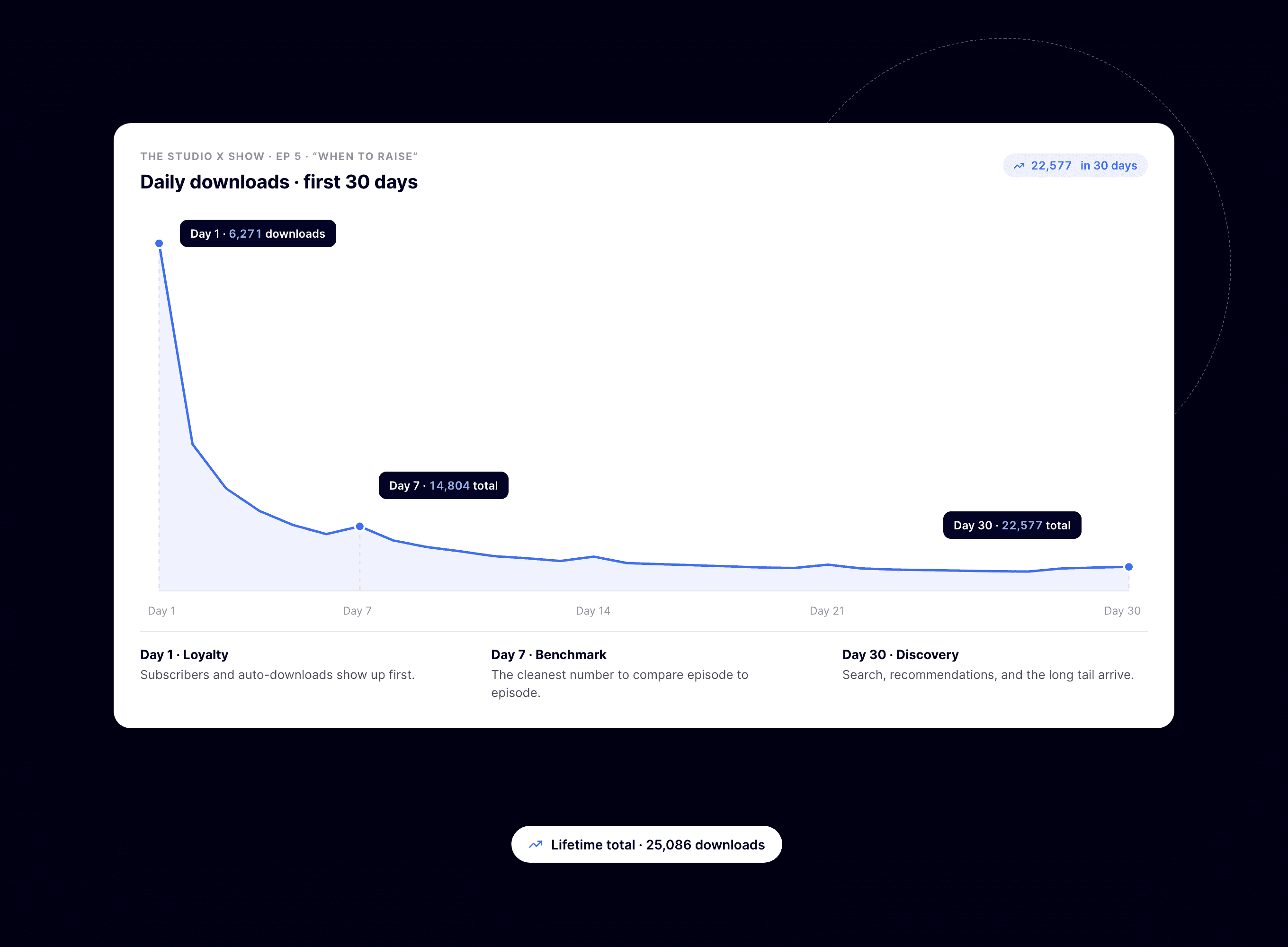
Most episodes follow a familiar arc: a spike in the first day or two as apps fetch the new episode for subscribers, a steep decay across the first week, then a long, low tail.
Each phase answers a different question:
Day 1–2: how many people have you trained to expect you — your core subscriber pull
Day 3–7: your engaged-but-casual listeners catching up on their own schedule
Day 8–30: discovery — new listeners, search traffic, shares, and playlist stragglers
The 7-day mark matters because it’s the standard window in commonly cited industry benchmarks, so it’s the cleanest number for comparing your show against the wider world.
What each checkpoint tells you
Day 1: the loyalty reading
Day-1 downloads barely react to the episode’s topic — subscribers download before they know if it’s good. A shrinking day-1 number across episodes is an audience-attention problem, not a content problem.
Day 7: the benchmark number
By a week in, your regulars have shown up. Day-7 totals are your most comparable per-episode metric and the honest input for sponsor math.
Day 30: the discovery signal
The gap between day 7 and day 30 measures how well an episode travels beyond your existing audience. A big gap means the topic or guest is pulling in strangers — pay attention to that.
The back-catalog tail: your quiet compounding asset
After day 30, a healthy episode never quite hits zero. New listeners arrive, like what they hear, and raid the archive. Across a mature catalog those tails add up to a meaningful slice of monthly downloads.
The tail is diagnostic, too:
Rising tails across the catalog mean new-listener acquisition is working
Flat tails mean growth depends entirely on release day — fragile
Evergreen episodes with fat tails tell you which topics to make more of, and which to link in show notes
Aligned comparison: how breakout topics reveal themselves
Raw totals lie because older episodes have had more time. The fair fight is aligning every episode to its own launch day — day 14 versus day 14, day 30 versus day 30.
Overlay a few curves that way and patterns jump out:
Identical day-1 starts with diverging tails: same audience showed up, but one topic traveled — a format or topic signal
One episode starting higher across the board: something external drove it, like a guest’s promotion or a mention
A rising floor across recent episodes: your baseline audience is genuinely growing, the healthiest chart in podcasting
Do this for every episode and you stop guessing which topics work. The curves tell you.
A practical cadence: at each month’s end, overlay that month’s episodes against your prior three months of curves. Ten minutes of looking at shapes will tell you more about your content strategy than an afternoon of staring at totals.
Conclusion
The first 30 days separate loyalty (day 1), engagement (day 7), and discovery (day 30) — and the tail beyond them shows whether your show compounds. Read the shape, not just the total.
BuzzyPod charts every episode’s first-30-day launch curve and lets you compare episodes aligned day-by-day from launch — $10/month, 14-day free trial, no spreadsheet gymnastics required.
Related reading
Introduction
An episode’s download total is a number; its first 30 days are a story. Podcast episode performance lives in the shape of the launch curve — how fast downloads arrive, when they slow, and what’s left flowing after the initial rush.
Two episodes can end month one with identical totals and mean completely different things: one carried by your loyal base, the other still pulling in strangers on day 25.
This post walks through the day-1/day-7/day-30 pattern, the back-catalog tail, and how aligned episode comparisons surface your breakout topics.
Key takeaway
Day 1–2 downloads measure your subscriber base and release-day habit
Day 7 captures your true engaged audience — a standard benchmarking window
Days 8–30 reveal discovery: search, shares, and new-listener catch-up
The back-catalog tail is your compounding asset — flat tails mean stalled acquisition
Comparing episodes aligned day-by-day from launch is the only fair comparison
The anatomy of a launch curve
Most episodes follow a familiar arc: a spike in the first day or two as apps fetch the new episode for subscribers, a steep decay across the first week, then a long, low tail.
Each phase answers a different question:
Day 1–2: how many people have you trained to expect you — your core subscriber pull
Day 3–7: your engaged-but-casual listeners catching up on their own schedule
Day 8–30: discovery — new listeners, search traffic, shares, and playlist stragglers
The 7-day mark matters because it’s the standard window in commonly cited industry benchmarks, so it’s the cleanest number for comparing your show against the wider world.
What each checkpoint tells you
Day 1: the loyalty reading
Day-1 downloads barely react to the episode’s topic — subscribers download before they know if it’s good. A shrinking day-1 number across episodes is an audience-attention problem, not a content problem.
Day 7: the benchmark number
By a week in, your regulars have shown up. Day-7 totals are your most comparable per-episode metric and the honest input for sponsor math.
Day 30: the discovery signal
The gap between day 7 and day 30 measures how well an episode travels beyond your existing audience. A big gap means the topic or guest is pulling in strangers — pay attention to that.
The back-catalog tail: your quiet compounding asset
After day 30, a healthy episode never quite hits zero. New listeners arrive, like what they hear, and raid the archive. Across a mature catalog those tails add up to a meaningful slice of monthly downloads.
The tail is diagnostic, too:
Rising tails across the catalog mean new-listener acquisition is working
Flat tails mean growth depends entirely on release day — fragile
Evergreen episodes with fat tails tell you which topics to make more of, and which to link in show notes
Aligned comparison: how breakout topics reveal themselves
Raw totals lie because older episodes have had more time. The fair fight is aligning every episode to its own launch day — day 14 versus day 14, day 30 versus day 30.
Overlay a few curves that way and patterns jump out:
Identical day-1 starts with diverging tails: same audience showed up, but one topic traveled — a format or topic signal
One episode starting higher across the board: something external drove it, like a guest’s promotion or a mention
A rising floor across recent episodes: your baseline audience is genuinely growing, the healthiest chart in podcasting
Do this for every episode and you stop guessing which topics work. The curves tell you.
A practical cadence: at each month’s end, overlay that month’s episodes against your prior three months of curves. Ten minutes of looking at shapes will tell you more about your content strategy than an afternoon of staring at totals.
Conclusion
The first 30 days separate loyalty (day 1), engagement (day 7), and discovery (day 30) — and the tail beyond them shows whether your show compounds. Read the shape, not just the total.
BuzzyPod charts every episode’s first-30-day launch curve and lets you compare episodes aligned day-by-day from launch — $10/month, 14-day free trial, no spreadsheet gymnastics required.
Related reading
Introduction
An episode’s download total is a number; its first 30 days are a story. Podcast episode performance lives in the shape of the launch curve — how fast downloads arrive, when they slow, and what’s left flowing after the initial rush.
Two episodes can end month one with identical totals and mean completely different things: one carried by your loyal base, the other still pulling in strangers on day 25.
This post walks through the day-1/day-7/day-30 pattern, the back-catalog tail, and how aligned episode comparisons surface your breakout topics.
Key takeaway
Day 1–2 downloads measure your subscriber base and release-day habit
Day 7 captures your true engaged audience — a standard benchmarking window
Days 8–30 reveal discovery: search, shares, and new-listener catch-up
The back-catalog tail is your compounding asset — flat tails mean stalled acquisition
Comparing episodes aligned day-by-day from launch is the only fair comparison
The anatomy of a launch curve
Most episodes follow a familiar arc: a spike in the first day or two as apps fetch the new episode for subscribers, a steep decay across the first week, then a long, low tail.
Each phase answers a different question:
Day 1–2: how many people have you trained to expect you — your core subscriber pull
Day 3–7: your engaged-but-casual listeners catching up on their own schedule
Day 8–30: discovery — new listeners, search traffic, shares, and playlist stragglers
The 7-day mark matters because it’s the standard window in commonly cited industry benchmarks, so it’s the cleanest number for comparing your show against the wider world.
What each checkpoint tells you
Day 1: the loyalty reading
Day-1 downloads barely react to the episode’s topic — subscribers download before they know if it’s good. A shrinking day-1 number across episodes is an audience-attention problem, not a content problem.
Day 7: the benchmark number
By a week in, your regulars have shown up. Day-7 totals are your most comparable per-episode metric and the honest input for sponsor math.
Day 30: the discovery signal
The gap between day 7 and day 30 measures how well an episode travels beyond your existing audience. A big gap means the topic or guest is pulling in strangers — pay attention to that.
The back-catalog tail: your quiet compounding asset
After day 30, a healthy episode never quite hits zero. New listeners arrive, like what they hear, and raid the archive. Across a mature catalog those tails add up to a meaningful slice of monthly downloads.
The tail is diagnostic, too:
Rising tails across the catalog mean new-listener acquisition is working
Flat tails mean growth depends entirely on release day — fragile
Evergreen episodes with fat tails tell you which topics to make more of, and which to link in show notes
Aligned comparison: how breakout topics reveal themselves
Raw totals lie because older episodes have had more time. The fair fight is aligning every episode to its own launch day — day 14 versus day 14, day 30 versus day 30.
Overlay a few curves that way and patterns jump out:
Identical day-1 starts with diverging tails: same audience showed up, but one topic traveled — a format or topic signal
One episode starting higher across the board: something external drove it, like a guest’s promotion or a mention
A rising floor across recent episodes: your baseline audience is genuinely growing, the healthiest chart in podcasting
Do this for every episode and you stop guessing which topics work. The curves tell you.
A practical cadence: at each month’s end, overlay that month’s episodes against your prior three months of curves. Ten minutes of looking at shapes will tell you more about your content strategy than an afternoon of staring at totals.
Conclusion
The first 30 days separate loyalty (day 1), engagement (day 7), and discovery (day 30) — and the tail beyond them shows whether your show compounds. Read the shape, not just the total.
BuzzyPod charts every episode’s first-30-day launch curve and lets you compare episodes aligned day-by-day from launch — $10/month, 14-day free trial, no spreadsheet gymnastics required.

