How to read your podcast download charts: spikes, drops, and trends

Nathaniel DeSantis
Podcast Analytics

Introduction
A podcast download chart is an EKG for your show — but only if you can read it. Most podcasters glance at the squiggle, feel vaguely good or bad, and close the tab.
The squiggle has grammar. Spikes, rhythms, decays, and plateaus each mean something specific, and once you know how to read podcast download charts, a month of data starts answering real questions.
Here’s the field guide: what each shape means, and which scary-looking drops are nothing at all.
Key takeaway
Release-day spikes measure subscriber loyalty; their height should trend up over time
Weekday rhythm is normal — compare Tuesdays to Tuesdays, not to Saturdays
Decay after a spike is healthy; how high the tail settles is what matters
A plateau means acquisition equals attrition — steady, but not growing
Use 7-day and 30-day deltas, and remember February is a short month
The release-day spike
Publish an episode and your daily chart jumps — apps fetch the new file for subscribers within hours. That spike height is effectively a loyalty meter.
What to watch across releases:
Spike height trending up: your subscriber base is growing
Spikes flat while totals grow: back catalog is carrying growth — good, but different
A sudden short spike on a non-release day: something external happened — find it and try to repeat it
The weekday rhythm
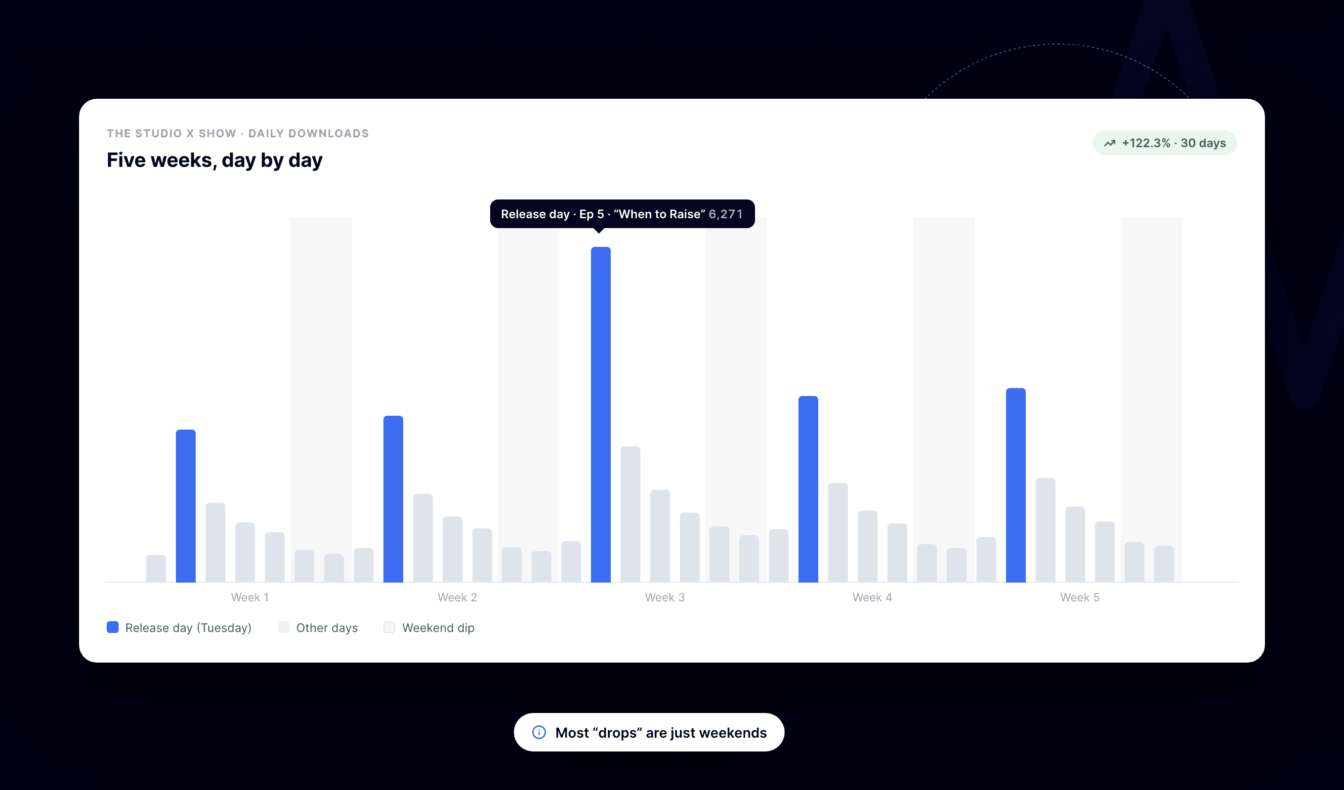
Zoom out and you’ll see a weekly heartbeat: commute-heavy weekdays typically outperform weekends for most shows. This is normal listener behavior, not your content wobbling.
The practical rule: compare like with like. This Tuesday against last Tuesday tells you something; Tuesday against Saturday tells you people have weekends.
Decay curves and what a plateau really means
Every spike decays — that’s physics, not failure. Subscribers download early, then the episode settles into its tail. The question is where it settles: an episode that levels off at a higher daily trickle than the last one is quietly outperforming it.
A plateau on your overall trend line is subtler. Flat means your new-listener inflow exactly matches your churn. Interpretations:
After a growth spurt: normal digestion, not decline
For many months: acquisition has stalled — time to change something upstream, not tweak episode titles
With a rising release-day spike underneath: your core is growing while casual listeners churn — retention is the lever
7-day and 30-day deltas: your instrument panel
Daily numbers are noisy; deltas smooth them into signal. A 7-day change tells you what this week did versus last week. A 30-day change tells you whether the season is trending up or down.
Read them together:
7-day up, 30-day up: genuine momentum — figure out what’s working and do more of it
7-day down, 30-day up: probably a soft week or release-schedule timing — don’t panic
7-day up, 30-day down: a good week inside a slow slide — encouraging, unproven
Both down for consecutive checks: a real trend that deserves a real response
When a “drop” is nothing at all
Before rethinking your entire show, check the boring explanations:
Short months — February has about 10% fewer days than January, so monthly totals dip on schedule
Comparing a five-release month to a four-release month
Holidays — listening dips around them for almost everyone
A release that slipped a day, shifting a spike across a week or month boundary
Summer softness that recovers every September, right on cue
A real problem shows up as several weeks of like-for-like decline: same weekday, same release cadence, still falling. Anything less is usually the calendar messing with you.
A good habit: before reacting to any dip, write down the boring explanation you’d expect, then check the chart against it. Nine times out of ten the boring explanation wins, and you’ve saved yourself a panicked format change.
Conclusion
Spikes measure loyalty, rhythm is just human schedules, decay is normal, plateaus are a fork in the road, and half of all scary drops are the calendar. Read shapes and deltas, not single days.
BuzzyPod’s dashboard puts the daily chart, 7-day and 30-day changes, and per-episode curves in one place — $10/month, 14-day free trial, so the squiggle finally makes sense.
Related reading
Introduction
A podcast download chart is an EKG for your show — but only if you can read it. Most podcasters glance at the squiggle, feel vaguely good or bad, and close the tab.
The squiggle has grammar. Spikes, rhythms, decays, and plateaus each mean something specific, and once you know how to read podcast download charts, a month of data starts answering real questions.
Here’s the field guide: what each shape means, and which scary-looking drops are nothing at all.
Key takeaway
Release-day spikes measure subscriber loyalty; their height should trend up over time
Weekday rhythm is normal — compare Tuesdays to Tuesdays, not to Saturdays
Decay after a spike is healthy; how high the tail settles is what matters
A plateau means acquisition equals attrition — steady, but not growing
Use 7-day and 30-day deltas, and remember February is a short month
The release-day spike
Publish an episode and your daily chart jumps — apps fetch the new file for subscribers within hours. That spike height is effectively a loyalty meter.
What to watch across releases:
Spike height trending up: your subscriber base is growing
Spikes flat while totals grow: back catalog is carrying growth — good, but different
A sudden short spike on a non-release day: something external happened — find it and try to repeat it
The weekday rhythm
Zoom out and you’ll see a weekly heartbeat: commute-heavy weekdays typically outperform weekends for most shows. This is normal listener behavior, not your content wobbling.
The practical rule: compare like with like. This Tuesday against last Tuesday tells you something; Tuesday against Saturday tells you people have weekends.
Decay curves and what a plateau really means
Every spike decays — that’s physics, not failure. Subscribers download early, then the episode settles into its tail. The question is where it settles: an episode that levels off at a higher daily trickle than the last one is quietly outperforming it.
A plateau on your overall trend line is subtler. Flat means your new-listener inflow exactly matches your churn. Interpretations:
After a growth spurt: normal digestion, not decline
For many months: acquisition has stalled — time to change something upstream, not tweak episode titles
With a rising release-day spike underneath: your core is growing while casual listeners churn — retention is the lever
7-day and 30-day deltas: your instrument panel
Daily numbers are noisy; deltas smooth them into signal. A 7-day change tells you what this week did versus last week. A 30-day change tells you whether the season is trending up or down.
Read them together:
7-day up, 30-day up: genuine momentum — figure out what’s working and do more of it
7-day down, 30-day up: probably a soft week or release-schedule timing — don’t panic
7-day up, 30-day down: a good week inside a slow slide — encouraging, unproven
Both down for consecutive checks: a real trend that deserves a real response
When a “drop” is nothing at all
Before rethinking your entire show, check the boring explanations:
Short months — February has about 10% fewer days than January, so monthly totals dip on schedule
Comparing a five-release month to a four-release month
Holidays — listening dips around them for almost everyone
A release that slipped a day, shifting a spike across a week or month boundary
Summer softness that recovers every September, right on cue
A real problem shows up as several weeks of like-for-like decline: same weekday, same release cadence, still falling. Anything less is usually the calendar messing with you.
A good habit: before reacting to any dip, write down the boring explanation you’d expect, then check the chart against it. Nine times out of ten the boring explanation wins, and you’ve saved yourself a panicked format change.
Conclusion
Spikes measure loyalty, rhythm is just human schedules, decay is normal, plateaus are a fork in the road, and half of all scary drops are the calendar. Read shapes and deltas, not single days.
BuzzyPod’s dashboard puts the daily chart, 7-day and 30-day changes, and per-episode curves in one place — $10/month, 14-day free trial, so the squiggle finally makes sense.
Related reading
Introduction
A podcast download chart is an EKG for your show — but only if you can read it. Most podcasters glance at the squiggle, feel vaguely good or bad, and close the tab.
The squiggle has grammar. Spikes, rhythms, decays, and plateaus each mean something specific, and once you know how to read podcast download charts, a month of data starts answering real questions.
Here’s the field guide: what each shape means, and which scary-looking drops are nothing at all.
Key takeaway
Release-day spikes measure subscriber loyalty; their height should trend up over time
Weekday rhythm is normal — compare Tuesdays to Tuesdays, not to Saturdays
Decay after a spike is healthy; how high the tail settles is what matters
A plateau means acquisition equals attrition — steady, but not growing
Use 7-day and 30-day deltas, and remember February is a short month
The release-day spike
Publish an episode and your daily chart jumps — apps fetch the new file for subscribers within hours. That spike height is effectively a loyalty meter.
What to watch across releases:
Spike height trending up: your subscriber base is growing
Spikes flat while totals grow: back catalog is carrying growth — good, but different
A sudden short spike on a non-release day: something external happened — find it and try to repeat it
The weekday rhythm
Zoom out and you’ll see a weekly heartbeat: commute-heavy weekdays typically outperform weekends for most shows. This is normal listener behavior, not your content wobbling.
The practical rule: compare like with like. This Tuesday against last Tuesday tells you something; Tuesday against Saturday tells you people have weekends.
Decay curves and what a plateau really means
Every spike decays — that’s physics, not failure. Subscribers download early, then the episode settles into its tail. The question is where it settles: an episode that levels off at a higher daily trickle than the last one is quietly outperforming it.
A plateau on your overall trend line is subtler. Flat means your new-listener inflow exactly matches your churn. Interpretations:
After a growth spurt: normal digestion, not decline
For many months: acquisition has stalled — time to change something upstream, not tweak episode titles
With a rising release-day spike underneath: your core is growing while casual listeners churn — retention is the lever
7-day and 30-day deltas: your instrument panel
Daily numbers are noisy; deltas smooth them into signal. A 7-day change tells you what this week did versus last week. A 30-day change tells you whether the season is trending up or down.
Read them together:
7-day up, 30-day up: genuine momentum — figure out what’s working and do more of it
7-day down, 30-day up: probably a soft week or release-schedule timing — don’t panic
7-day up, 30-day down: a good week inside a slow slide — encouraging, unproven
Both down for consecutive checks: a real trend that deserves a real response
When a “drop” is nothing at all
Before rethinking your entire show, check the boring explanations:
Short months — February has about 10% fewer days than January, so monthly totals dip on schedule
Comparing a five-release month to a four-release month
Holidays — listening dips around them for almost everyone
A release that slipped a day, shifting a spike across a week or month boundary
Summer softness that recovers every September, right on cue
A real problem shows up as several weeks of like-for-like decline: same weekday, same release cadence, still falling. Anything less is usually the calendar messing with you.
A good habit: before reacting to any dip, write down the boring explanation you’d expect, then check the chart against it. Nine times out of ten the boring explanation wins, and you’ve saved yourself a panicked format change.
Conclusion
Spikes measure loyalty, rhythm is just human schedules, decay is normal, plateaus are a fork in the road, and half of all scary drops are the calendar. Read shapes and deltas, not single days.
BuzzyPod’s dashboard puts the daily chart, 7-day and 30-day changes, and per-episode curves in one place — $10/month, 14-day free trial, so the squiggle finally makes sense.

